…and our approach to color is no exception.
From the start, we wanted colours that weren’t just striking, but meaningful – two core colors that define who we are and how we show up in the world.
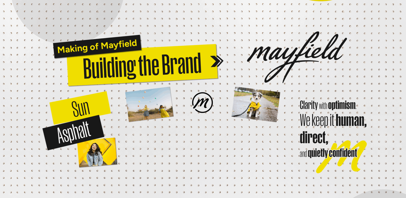
Our signature Sun Yellow radiates optimism and energy – it’s the spark that unites every touchpoint. It’s the color of possibilities and new beginnings, reminding us that travel should open doors, spark connection and inspire brighter futures.
Balancing that vibrancy is Asphalt, our deep, almost-black grey. It grounds the brand with strength and sophistication – a visual anchor that captures our dependability and clarity of purpose.
Together, Sun and Asphalt embody our vision at the heart of Mayfield – vibrant yet grounded, confident yet humble. It’s a pairing that reflects our mission to stand out with optimism while staying true to authenticity, care and the people who make good things happen.
Every detail is designed with intention.
…and the way we capture our world is no different.
Our photography isn’t just about what’s in frame, it’s about how it makes you feel. We lead with people, because hospitality begins with connection – the small gestures and expressions that make a place feel alive.
Our imagery celebrates those moments of warmth and welcome, the ones that remind you why travel matters in the first place. You’ll often notice bursts of yellow threaded through our visuals – a Mayfield signature that speaks to joy, curiosity, and the optimism at the heart of our brand. These pops of color bring energy to our imagery in every story we tell.
Alongside these human moments, we shine a light on place. From familiar cities to horizon views, we chose locational imagery that we believe reflects the character, rhythm, and beauty of the communities we’re showcasing.
We select photos that don’t just show our spaces – they make you feel like you’re already there. Seen. Cared for. Ready to explore.
Every design element has a voice.
…and our Typography is how ours speaks
Clear, confident, and full of character. It brings our words to life, balancing expression with ease of reading, and ensuring every message feels unmistakably Mayfield.
Beyond aesthetics, type defines how we’re experienced. It sets the rhythm of our communication – bold where we need impact, calm where we need clarity. The right typography builds recognition, consistency, and trust across every touchpoint.
Our headline font, Manuka, leads with personality. Bold, distinctive, and effortlessly modern, it captures attention and conveys the confidence at the heart of Mayfield. Manuka’s sculpted letterforms give our headlines presence, they’re how we announce ourselves to the world.
Figtree complements that strength with quiet clarity. As our body typeface, it’s approachable, versatile, and built for everyday readability. Figtree brings structure and warmth to our longer-form storytelling – giving Manuka the space to shine, while keeping our voice human and clear.
Together, Manuka and Figtree embody the Mayfield mindset – expressive yet grounded, creative yet considered. Typography that not only communicates our message, but feels like our brand in written form.
Every message is built for the people.
…and ours is for the people who make good things happen.
When we set out to define Mayfield’s voice, we didn’t start with taglines, logos, or headlines. We started with people. Not just the people who walk through the doors, but the owners who work hard to create memorable and unique experiences for guests. The teams who keep things running. These are the people who keep doors open, lights on, and communities moving. The ones whose businesses keep local economies alive. We know what that takes, because we’ve been there too. That shared understanding is the foundation of our brand.
Our voice is grounded in respect and understanding – not corporate polish, but real-world warmth.
Everything we create – from a headline to a social caption to a hotel story, is built to empower, include, and connect. We celebrate independence, not as isolation, but as strength: the freedom to run things your way, with the support of a brand that stands beside you.
Our tone balances clarity with optimism. We keep it human, direct, and quietly confident – because our audience doesn’t need grand speeches or layers of fluff. They need to feel seen, heard, and part of something bigger. A collective of people redefining what hospitality can be, for the independent hotel owners in our collection, and for our traveler’s looking for a unique experience.
At its heart, our messaging is a clear promise: to champion those who build, serve, and welcome. The ones who make guests feel at home – and the guests who deserve to feel seen themselves.
See more about the making of our brand and check out our mini-series on all things brand design!